Subway Map
My style takes inspiration from modern American subway maps, such as:
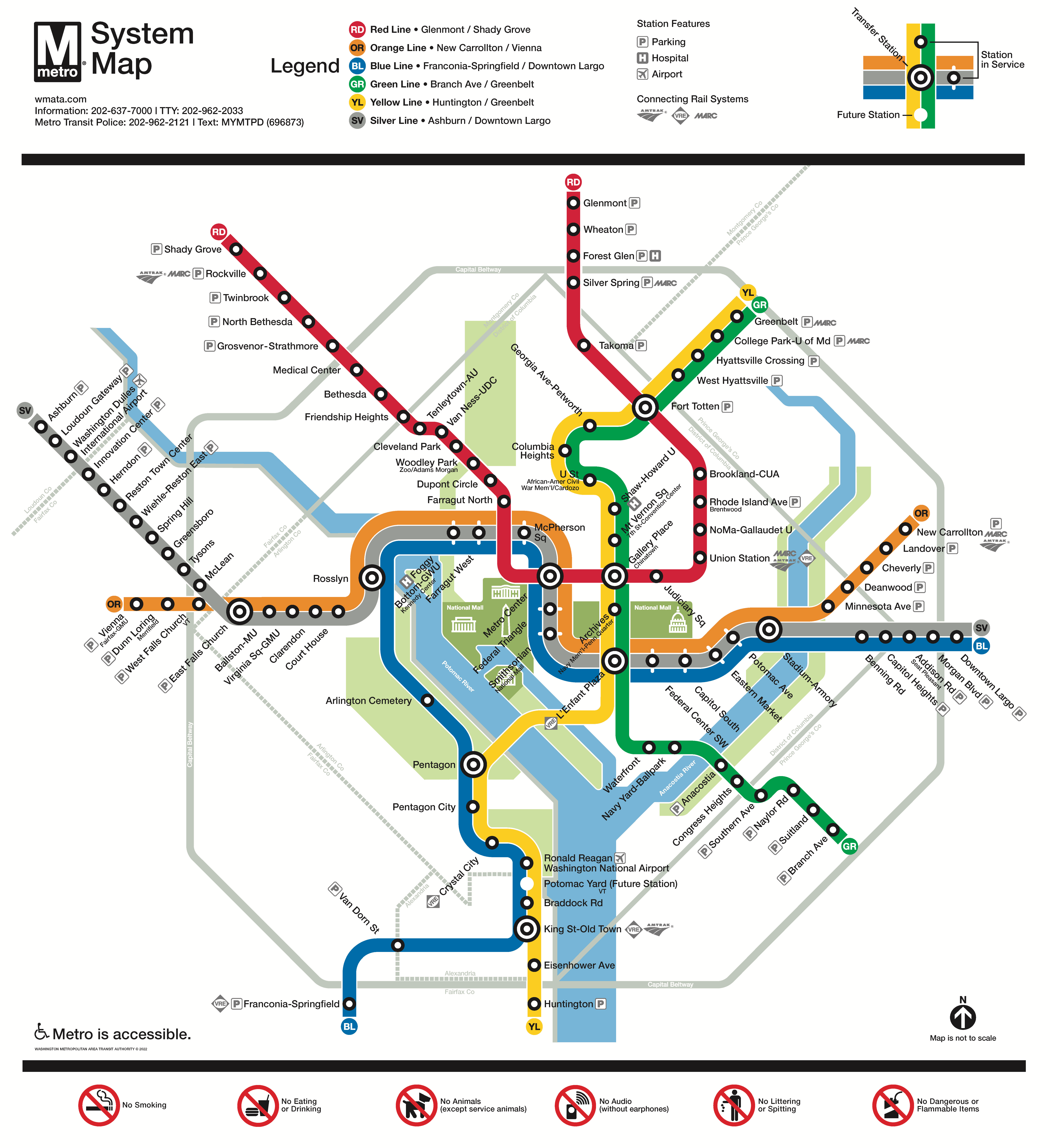
Washington D.C.,
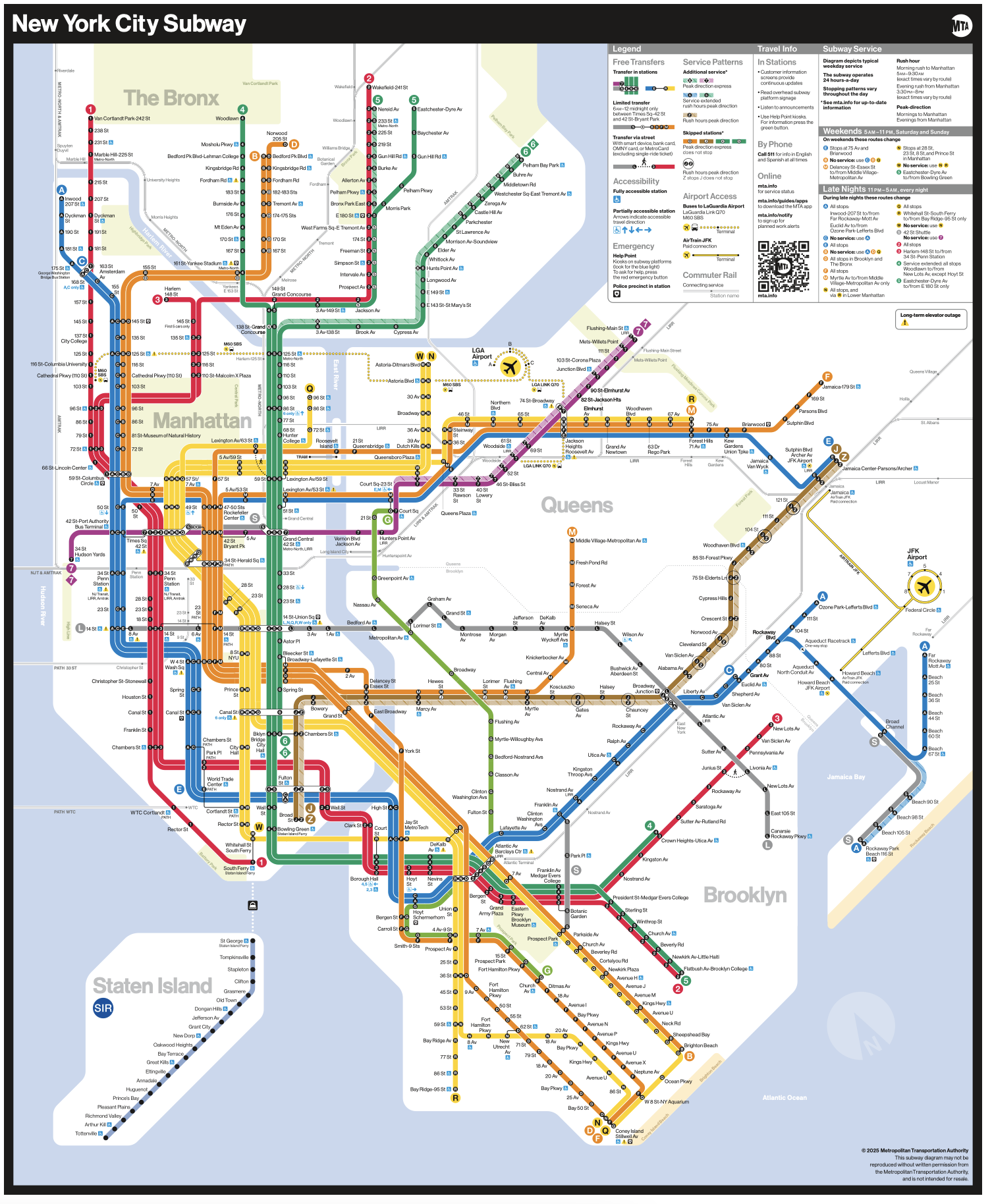
New York City,
and Chicago.
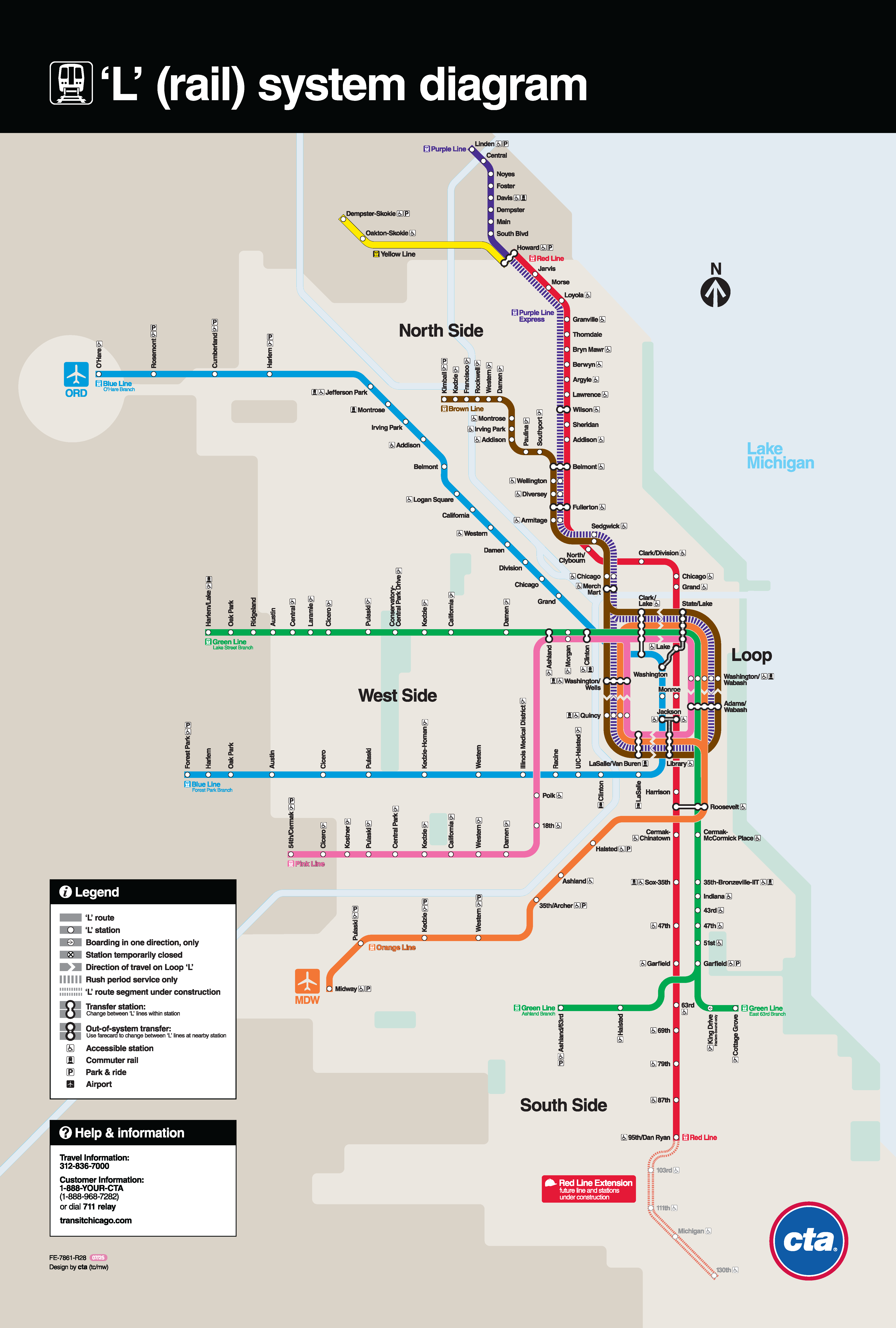
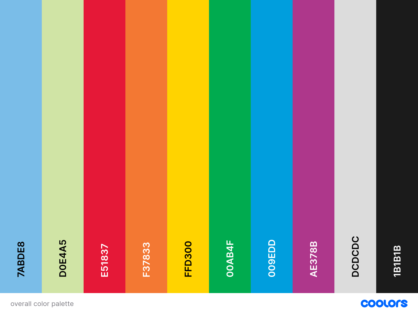
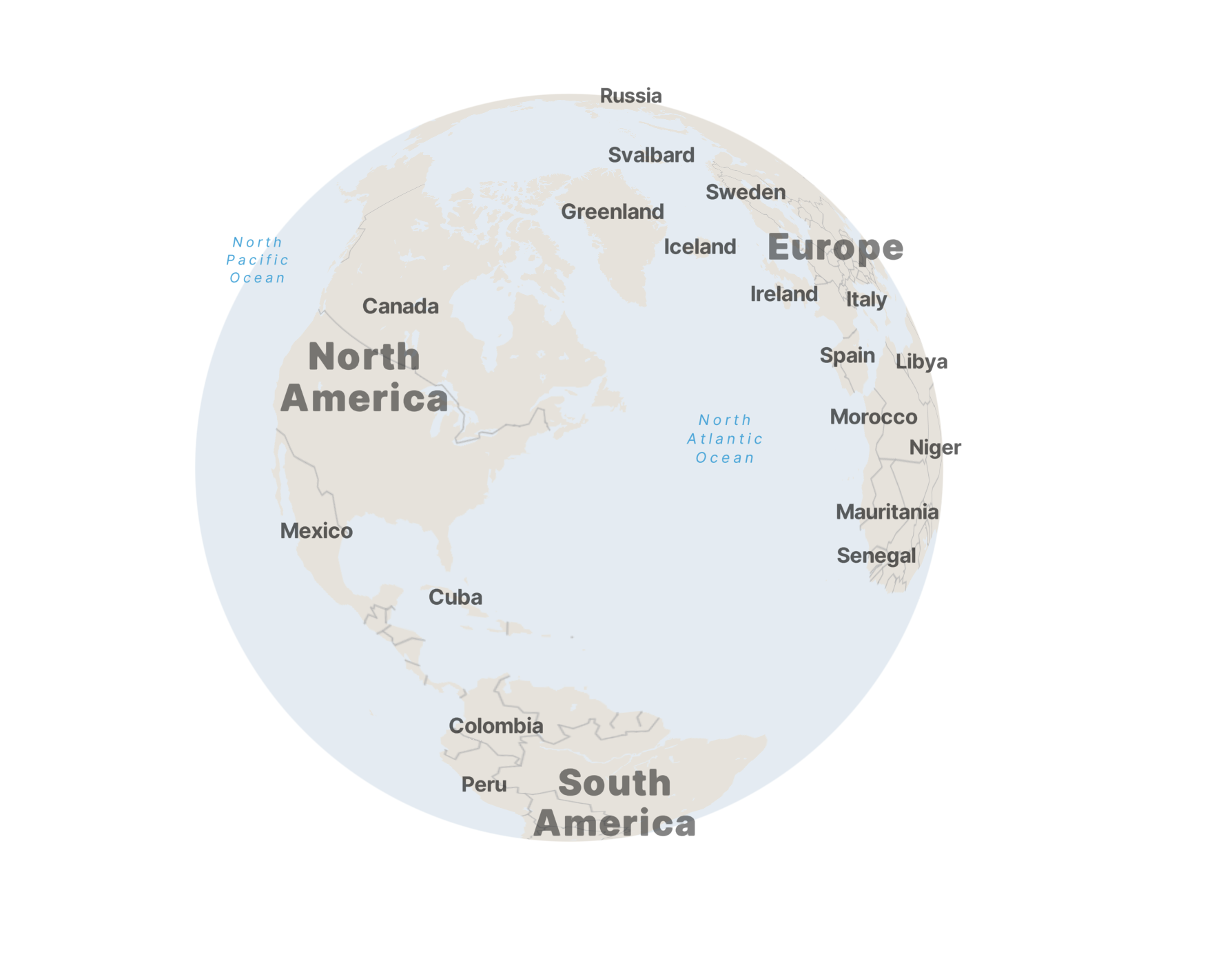
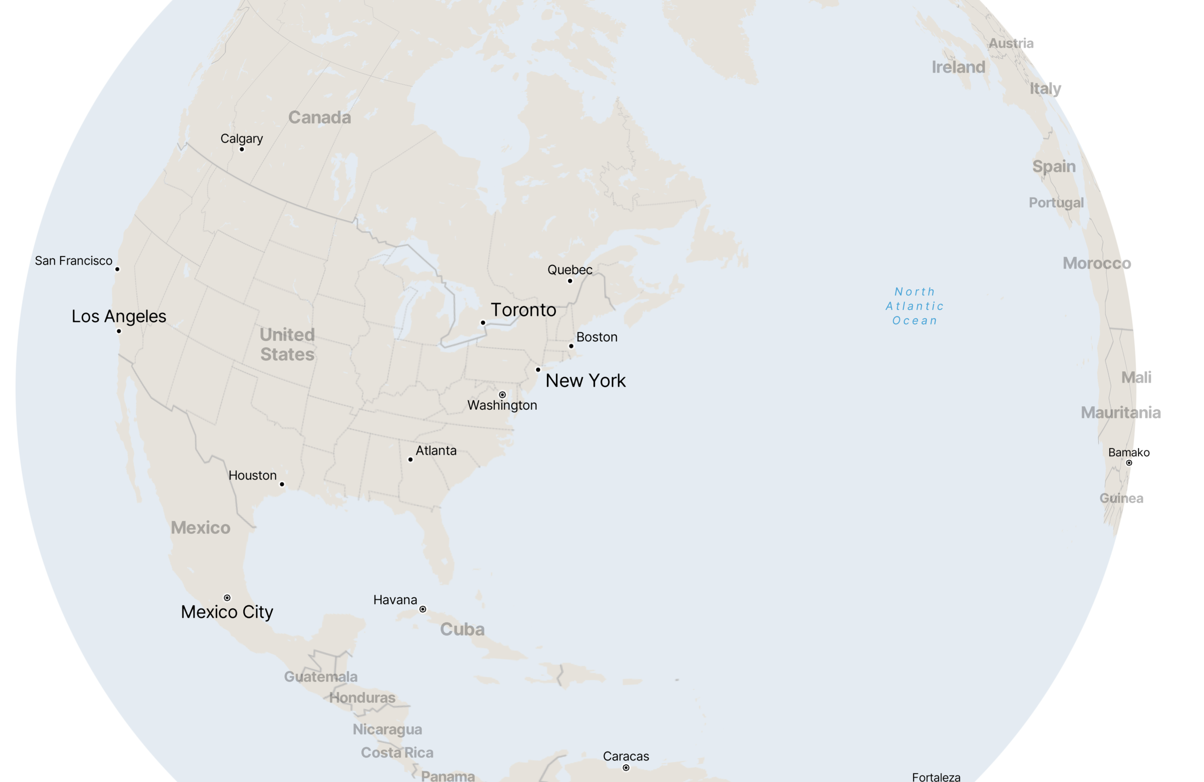
From these maps, I gathered a sample color palette that accentuates key characteristics of a subway map: bright, vivid hues, along with high-contrast grays and light shades of green and blue for land and water, respectively.
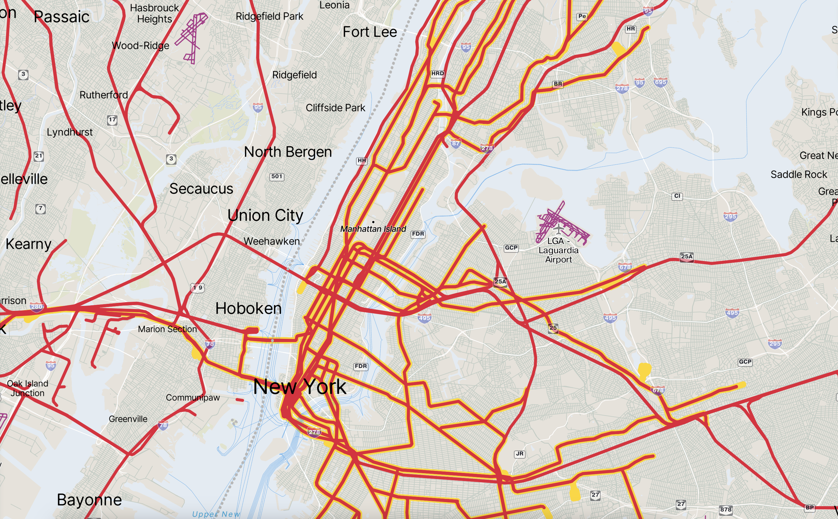
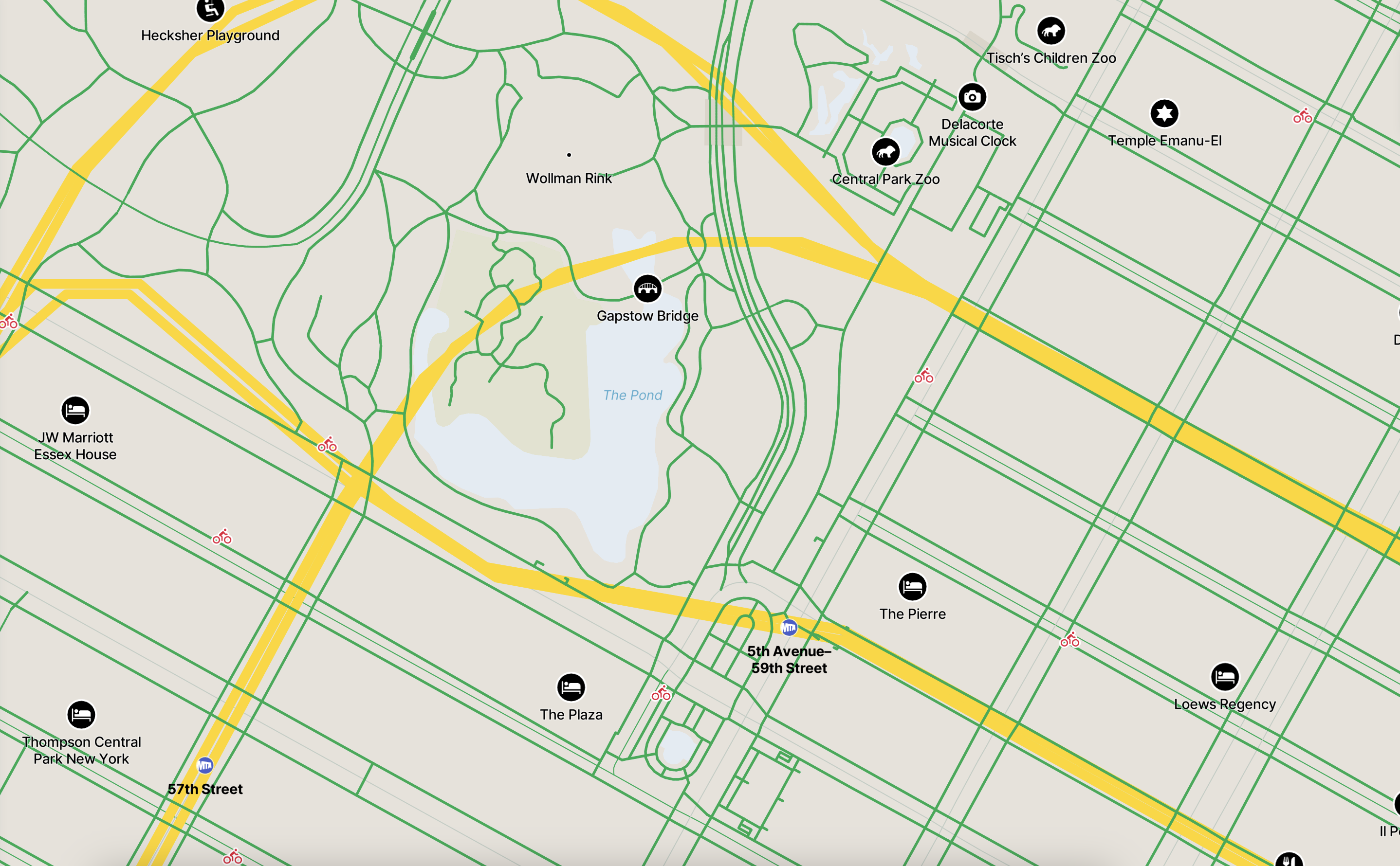
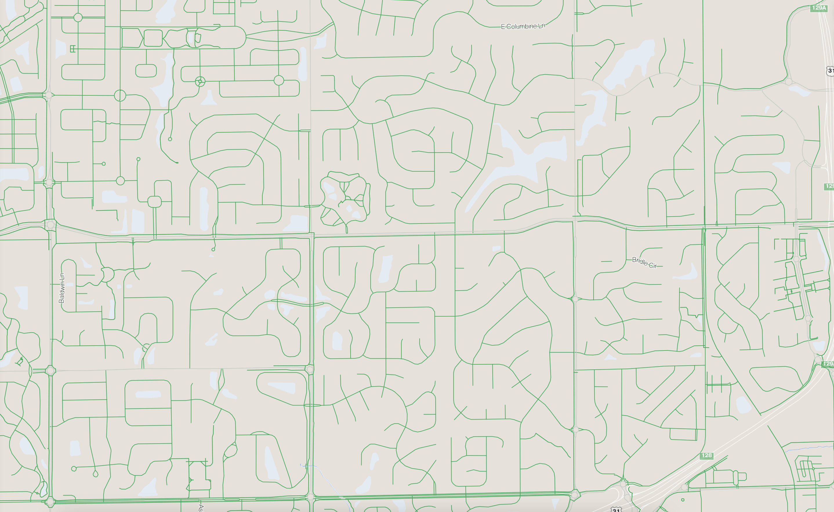
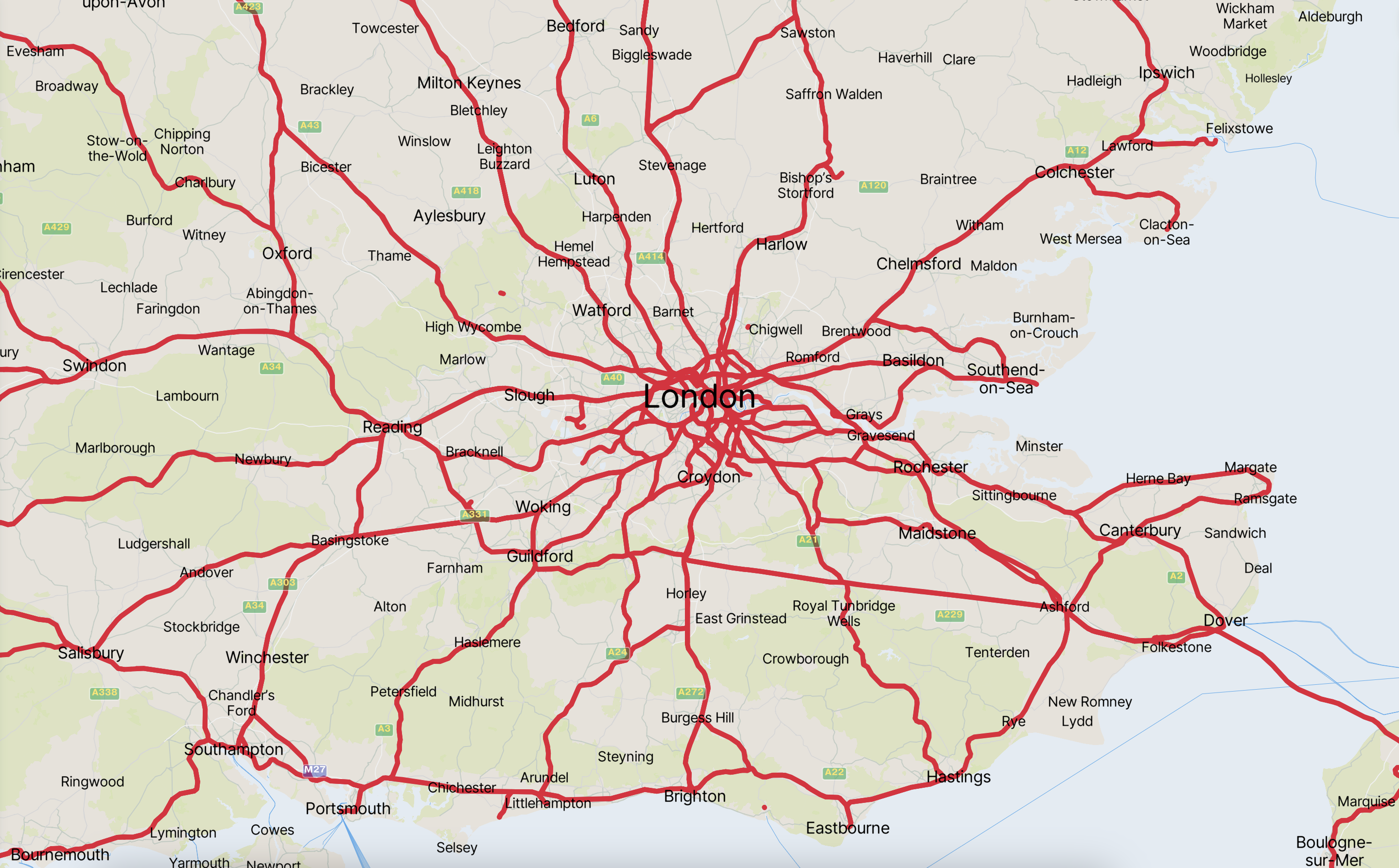
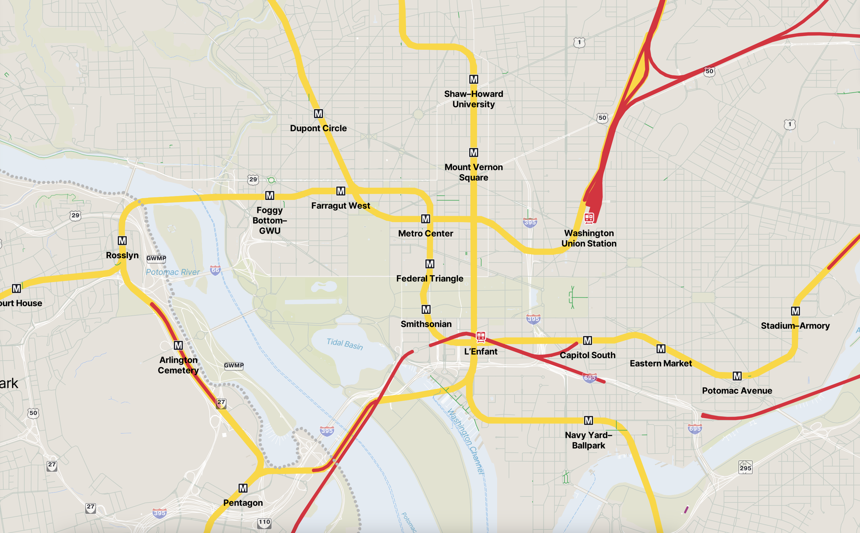
The map exaggerates place names and diverse forms of transit, like rail, subway, and pedestrian paths. Finer and less vivid road lines pull attention away from car-centric infrastructure.
Other design inspirations include curved lines with rounded caps, a lack of drop shadow behind text for a clean, flat appearance, and a mix of solid and dotted gray lines for territorial borders.
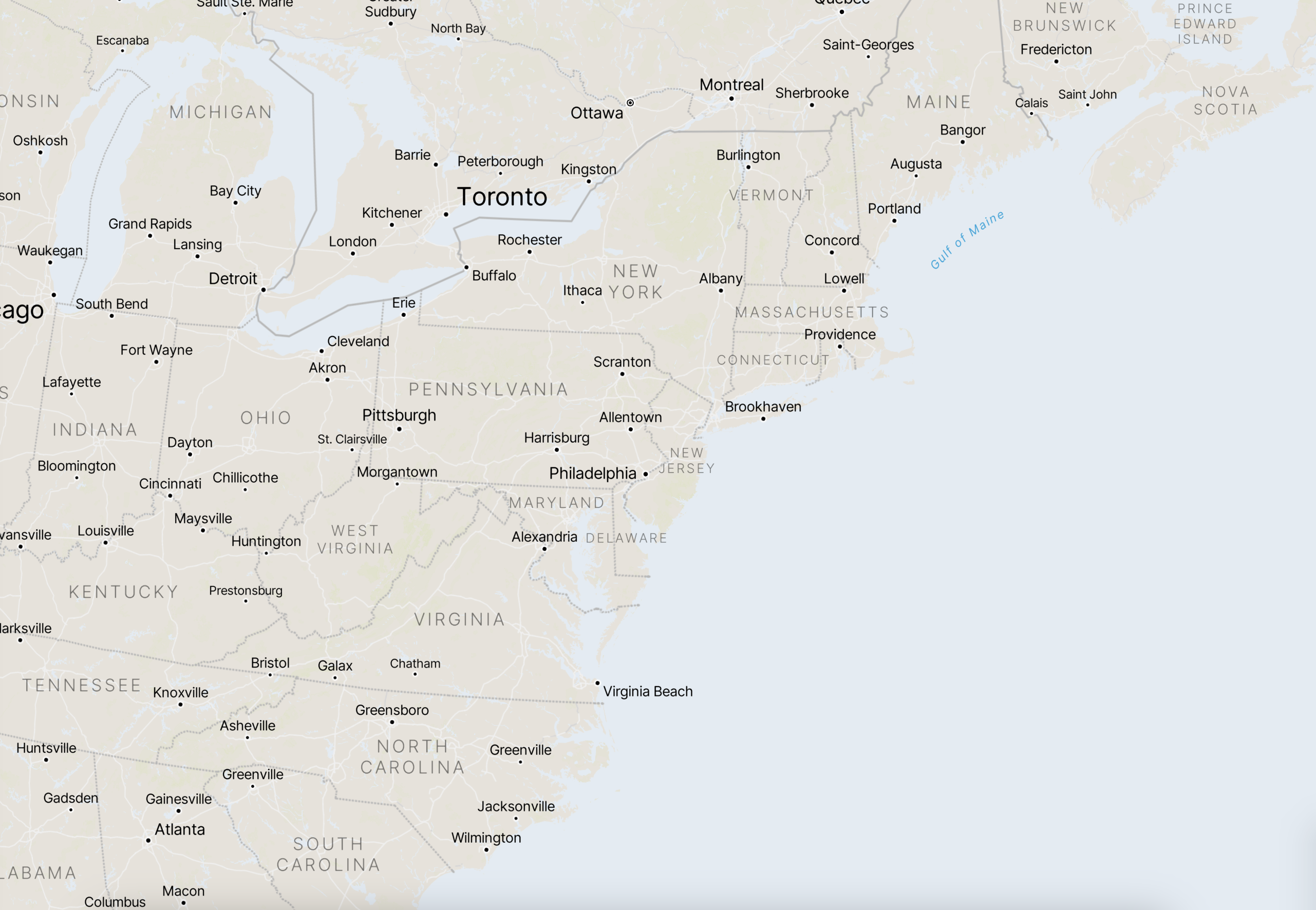
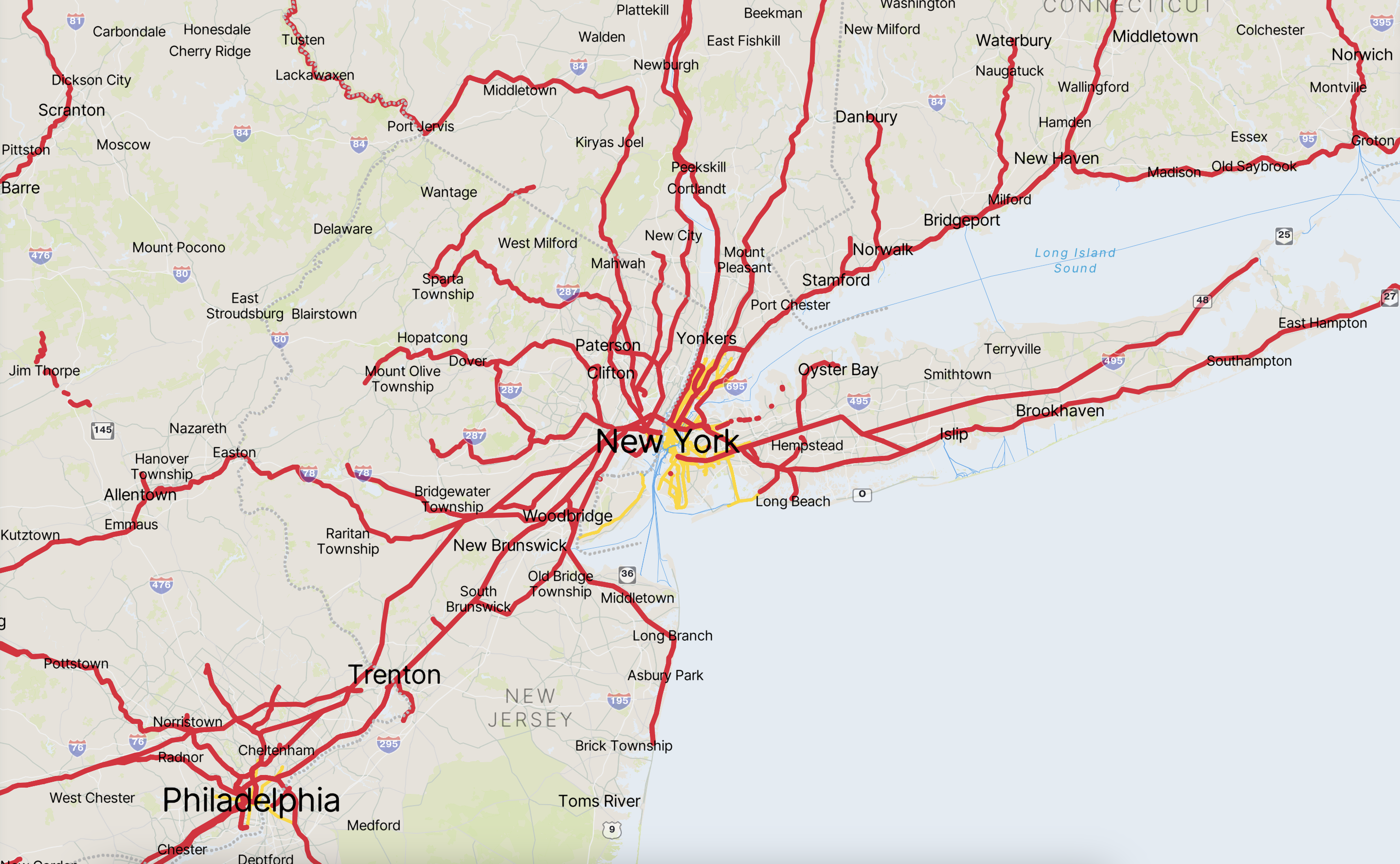
Different modes of transportation are represented by different colors, resulting in some awesome looking maps. For example:
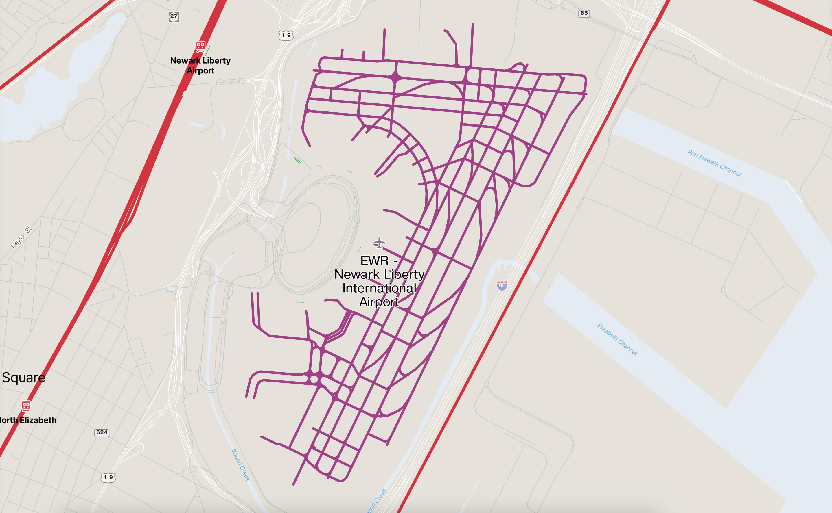
purple airport runways,
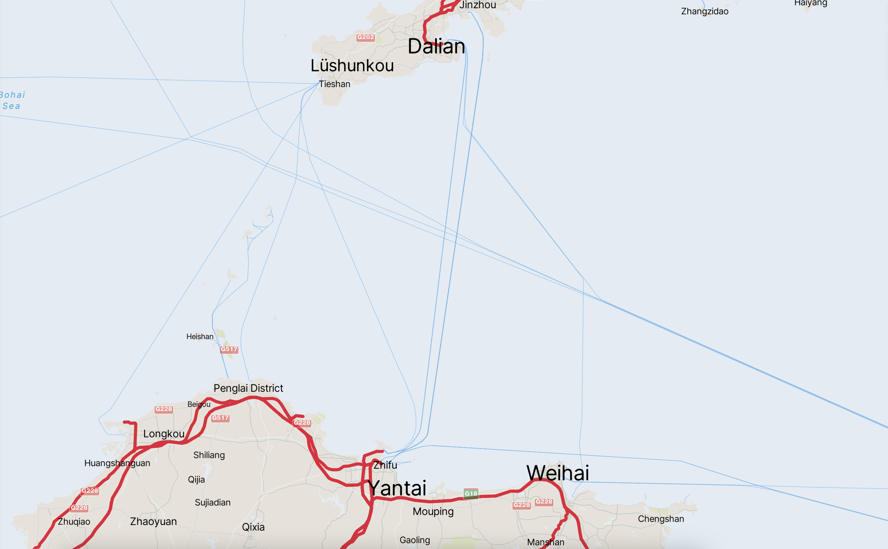
blue ferry lines,
green pedestrian paths, trails, and residential streets,
red railways,
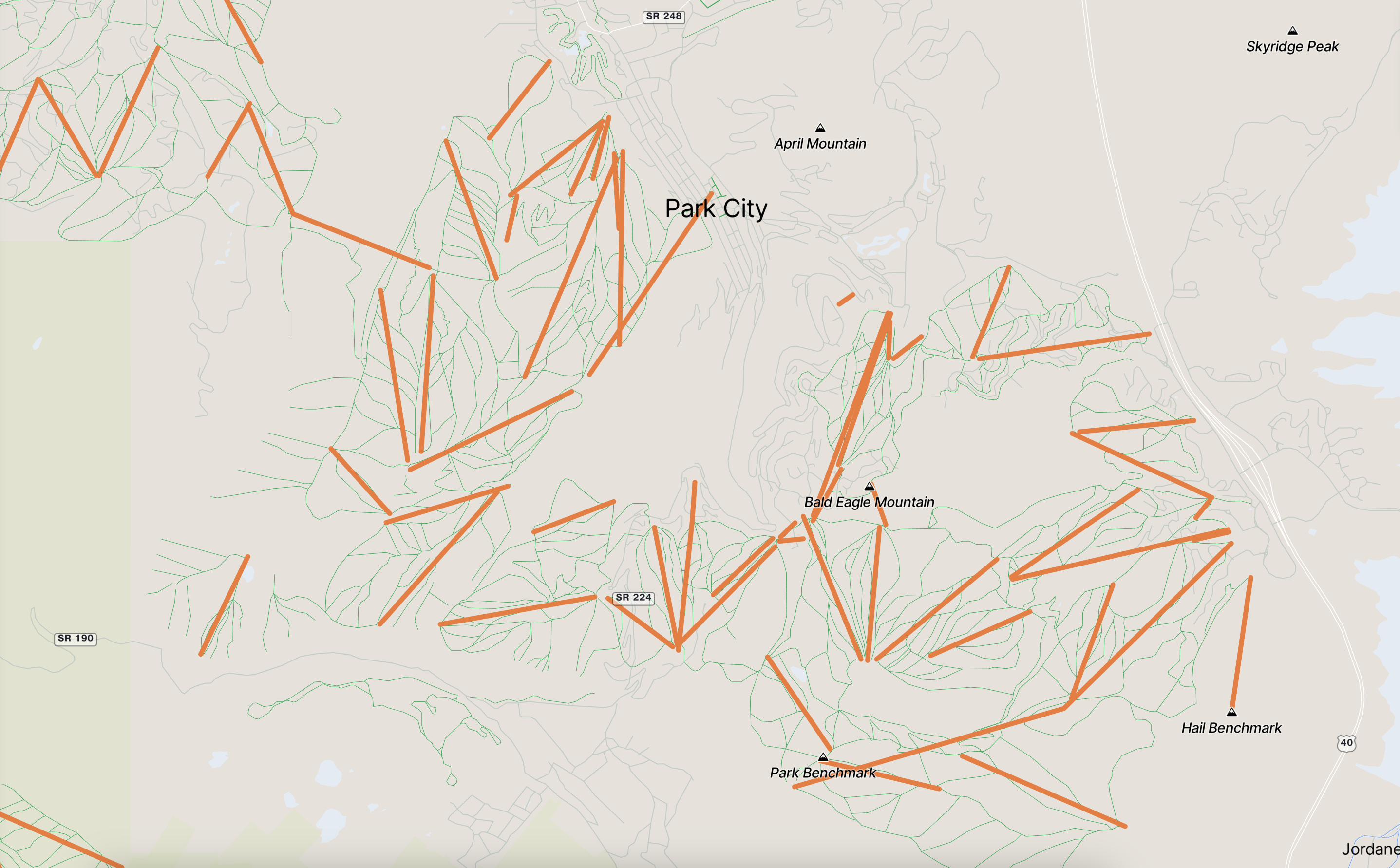
orange aeroways (such as chairlifts, cable cars, and light rail),
and, of course, subway lines in yellow!
Check out the full map here.
Credits:
Map created with Mapbox Studio
Data from openstreetmap
Images from the MTA, WMATA, and CTA.